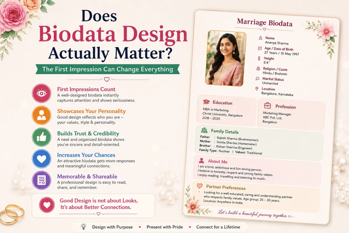
The conversation actually happening in matrimonial communities right now
There's a discussion happening in Indian matrimonial forums that's worth addressing directly, because it's a genuinely fair question and every biodata tool — including this one — has an obvious incentive to answer it one particular way.
Someone recently described the process of helping a friend build a biodata as painful — every template looked the same, every format felt like a job resume dressed up for a wedding, and the whole thing seemed stuck in an older era while everything else (wedding invites, portfolios, personal websites) had moved forward.
The most upvoted response to that post pushed back hard: nobody actually cares what the biodata looks like. It's not a dealbreaker. The real impression happens in the meeting, not in the screening document. Spending energy on visual polish, the argument went, is solving the wrong problem entirely.
Both of these positions are partly right, and the honest answer sits between them — which is what this post is actually about.
Where design genuinely helps
- Readability at phone-screen size — most biodatas are opened on a phone, often forwarded through two or three WhatsApp chats before reaching someone seriously reviewing it. A design with clear section breaks, adequate font size, and sensible spacing gets read completely. A dense, cluttered layout — even with excellent content — gets skimmed and misses its best details.
- One clear photo placement — since the photo is typically the first thing reviewed, a layout that presents it cleanly (not cropped awkwardly, not competing with busy borders) genuinely helps first impressions land correctly.
- Signalling effort, briefly — a biodata that looks like it was formatted in five rushed minutes in a Word document (inconsistent fonts, misaligned fields, default Times New Roman) can create a small, fair impression that the family didn't take the process seriously. This isn't about elaborate design; it's about basic competence being visible.
- Community-appropriate visual language — a biodata that opens with the right invocation, uses the correct community fields prominently, and looks like it was made specifically for a Hindu, Muslim, Sikh, or other family — rather than a generic template with fields awkwardly retrofitted — does communicate something real about attention to detail.
Where the design-obsession genuinely goes wrong
- Ornate templates that sacrifice readability — heavy decorative borders, elaborate script fonts, and busy backgrounds can look impressive in a full-screen preview and become genuinely hard to read once compressed into a WhatsApp PDF viewer on a mid-range phone.
- Treating design as a substitute for a real About Me section — no template, however beautiful, fixes an About Me that reads "I am a simple, family-oriented person who loves music and travel." Families remember specific facts, not fonts.
- Chasing trends instead of clarity — a biodata redesigned to look like a Notion page or a startup pitch deck might feel modern, but if the family receiving it can't quickly find the horoscope section or the contact number because the layout prioritizes aesthetics over structure, the design has actively worked against the document's purpose.
- Believing a "premium" paid template will meaningfully outperform a free, clean one — there is no evidence that a premium template converts better than a well-organized free one. What separates biodatas that get responses from ones that don't is almost always content.
The honest framework — what actually decides whether a biodata gets a response
Based on the patterns families and candidates describe across community discussions, roughly this is how much each factor actually contributes to whether a biodata leads to a serious response.
- The photo (roughly first impression, seconds 1–3) — recent, clear, natural. This matters enormously and has almost nothing to do with "design" in the template sense.
- The specific facts in About Me and family details (the actual decision driver) — this is where compatibility gets assessed. A specific, honest detail here does more work than any visual element on the page.
- Basic readability and organization (the floor, not the ceiling) — the biodata needs to be easy to scan and clearly organized. Beyond this baseline, additional design polish has rapidly diminishing returns.
- Ornate visual flourish beyond basic clarity — genuinely close to zero impact on response rate. This is the part of "design" that most templates compete on, and it is the part that matters least.
So what should you actually do?
Choose a clean, community-appropriate template — one that presents your information clearly without fighting for attention against your own content. Then spend the majority of your actual effort on: a recent, natural, well-lit photo; a specific, honest About Me section with one genuine fact, not a list of adjectives; complete, accurate fields with nothing left vague or blank that should be filled; and honest, generous partner preferences rather than a demand list.
This is not a call to ignore design entirely — a genuinely cluttered, hard-to-read biodata does cost responses. It's a call to correctly weight where your limited time and attention should go. Most people currently have this backwards: they spend an hour choosing between templates and five minutes on their About Me. The evidence from how families actually review biodatas suggests that ratio should be reversed.
Ready to create your own biodata? Start with our free builder or browse premium templates.