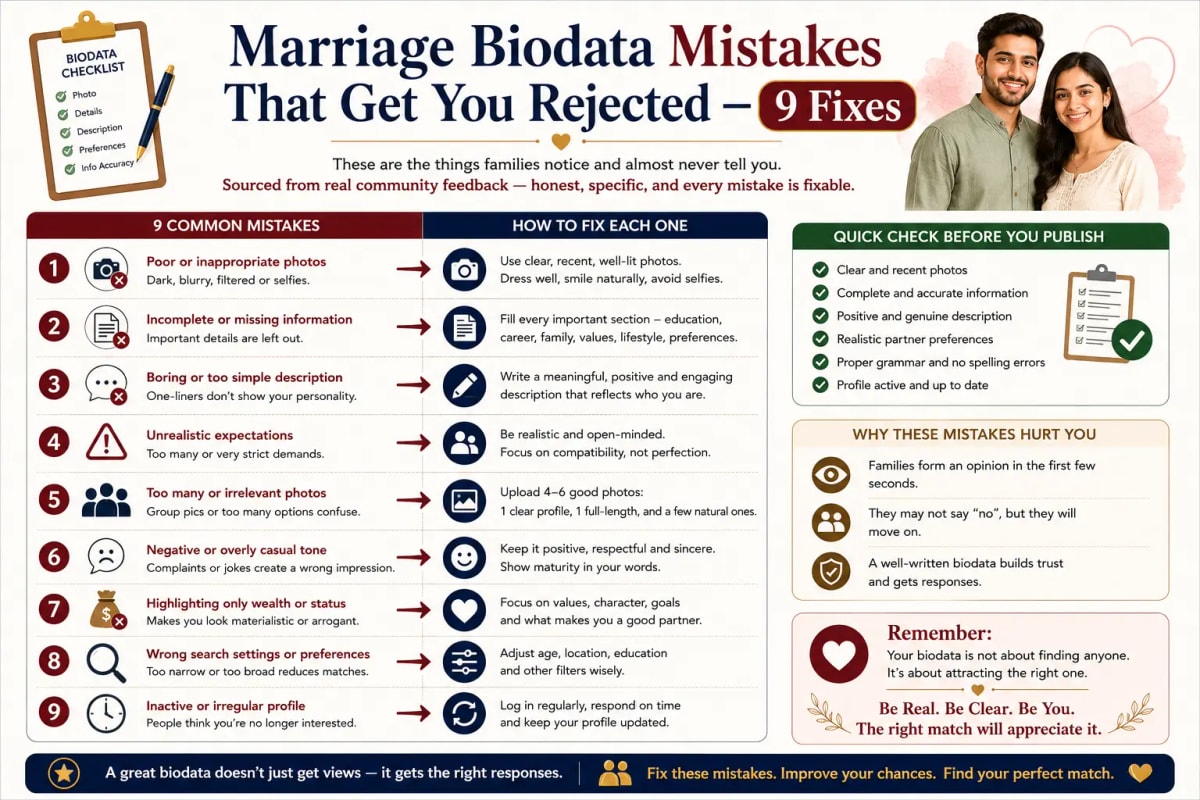
A word before the list
These are things that families say to each other — not to you. When your biodata gets set aside, nobody sends a reply saying 'we have passed on this because the photo was from 2022 and the About Me section was generic.' They just do not respond. So this feedback circulates in private — in conversations between parents, in matrimonial WhatsApp groups, on Reddit threads where people vent, on Quora where someone asks 'why is nobody responding to my son's biodata.' What follows are the real reasons, in plain language. Every single one is fixable. But you cannot fix what you do not know.
Mistake 1 — The photo is not recent, or it is from the wrong context
A mother in Hyderabad received a biodata for her daughter through a relative's WhatsApp group last October. The photo showed a young man in good clothes, smiling, with a clear background. She forwarded it to her husband. He looked at it and said, 'this photo is at least five or six years old — look at the collar style, and his face is younger.' They did not proceed. The family who sent that biodata had no idea the photo was read that way. This is how quickly and specifically a photo gets assessed — in the two or three seconds before someone reads the name.
What counts as wrong context: group photos, wedding function photos, formal ID-style photos, gym or car selfies, photos with sunglasses, photos where the background is cluttered or someone else's shoulder is visible. What counts as not recent: anything more than six months to a year old where you look noticeably younger or different. The fix: one portrait photo, natural light, plain background, recent. That is it. Read the full photo guide at /blog/biodata-for-marriage-photo-tips.
Mistake 2 — The About Me says something that could be said by anyone
The most common phrase in Indian marriage biodatas, across all communities, all cities, all years: 'I am a simple, family-oriented person who enjoys music, travel, and spending time with family.' If you wrote something close to this, you wrote something that roughly 70 percent of all biodatas also say. Not because everyone is lying — most people genuinely are family-oriented. But the phrase tells the other family nothing about who you are specifically. What the other family is thinking when they read this: okay, next one.
The point of the About Me is to create one moment where the person becomes a real human being rather than a set of facts. One specific detail — your actual hobby, something true about how you spend your weekends, one thing you genuinely care about — does more work than three sentences of generic adjectives. 'I coach my cousin's cricket team on Sunday mornings and it has become my favourite part of the week' tells a family: this person is generous, involved with extended family, consistent. The fix: replace one adjective with a fact. Full guide at /blog/how-to-write-about-me-in-marriage-biodata.
Mistake 3 — Two pages
Families reviewing biodatas are usually looking at several at a time — often on a phone, often in a spare 20 minutes. When a biodata comes in and scrolling past page one reveals a page two, most families do not read it. This is not because they are lazy. It is because when 15 biodatas come in a week and 10 of them are one page, the one-page ones feel like complete, efficient introductions. The two-page ones feel like they could not decide what to include. A biodata is not a resume. It is a first introduction. Everything needs to fit on one A4 page. The fix: use a template designed for single-page output. Shorten the About Me to 3 to 4 sentences. Remove any sub-sections that are redundant.
Mistake 4 — Missing horoscope fields for a Hindu family
For many Hindu families — especially those from North India, Maharashtra, South India — the horoscope section is not optional. It is the first section they check. When Gotra is blank, or Rashi is listed as a Western sun sign ('Scorpio') instead of the Vedic moon sign, or Manglik status says 'Not Known' — these are read as signals. Not necessarily that the family is hiding something, but that they did not take this process seriously enough to know their own basic details.
The specific ones that create the most friction: 'Gotra: Not applicable' in a clearly Hindu biodata — not the same as 'Gotra not known'; 'Not applicable' implies it does not matter, which will not go down well with a traditional family. Rashi listed as a Western zodiac sign — in Hindu matrimonial contexts, Rashi means the Vedic moon sign, calculated from your birth time and place, not the Western sun sign. Manglik status left completely blank — for families where this matters, a blank is as concerning as a Yes. The fix: find out your actual Gotra (ask your father), calculate your correct Vedic Rashi and Nakshatra from your date, time, and place of birth, and state Manglik status honestly.
Mistake 5 — Partner preferences that sound like a job specification
A real example, paraphrased from community discussion: one family sent out a biodata with the following partner preferences — 'Looking for a fair, slim girl, minimum 5'4", Masters degree or above, working in IT or healthcare, earning minimum 10 LPA, from UP or Maharashtra only, Brahmin preferred (Kanyakubj or Gaur), vegetarian only, willing to relocate abroad.' Eight requirements. Each one individually reasonable. Together, they create the impression of someone who has applied very specific filters before meeting anyone. The family receiving this biodata does not feel welcomed. They feel like their daughter is being screened. The irony: many families receiving this biodata might actually meet every criterion. But the tone makes them not want to respond.
The fix: write partner preferences as an invitation, not a filter. Keep requirements to three or four. Put values before specifics. Let the most personal requirements come up in conversation. Read the full guide at /blog/marriage-biodata-partner-preferences-what-to-write.
Mistake 6 — Information that does not match what can be found online
This one has increased significantly in the last three to four years because families now search for candidates on LinkedIn and social media before responding to a biodata. The most common mismatches: salary listed in the biodata is noticeably higher than the LinkedIn profile range suggests — this is noticed immediately and creates suspicion that is very difficult to recover from in conversation. Job title in the biodata is more senior than what LinkedIn shows at the same company. Age or date of birth that varies slightly between the biodata and what is visible on social profiles. None of these mismatches have to be intentional — a parent overstating their child's position out of pride, or using an informal title. But they read as dishonesty and they cost responses. The fix: be accurate. Use your current official job title and a genuine salary range. A biodata that undersells you slightly is infinitely better than one that oversells and gets caught.
Mistake 7 — The biodata was clearly made by a parent, not the candidate
There is a specific combination of signals that tells the family reviewing a biodata that the candidate did not write it themselves — and in some cases, was not really consulted: third person throughout ('She is a sincere and hardworking professional who values her family above all'); formal, slightly stiff language that does not match how the candidate's generation talks; About Me section that is entirely adjectives, no anecdotes; contact number is a parent's number with no mention of the candidate's own contact preferences; partner preferences written in formal terminology ('seeks an alliance with a well-settled boy from a respectable family') rather than a natural voice.
This is not always a problem — many families operate this way, and there is nothing wrong with parents being involved. But when the biodata reads as if the candidate was not present in its creation at all, families wonder whether the candidate is genuinely ready for marriage, or whether this is entirely family-driven. The fix: even if parents are managing the biodata process, have the candidate write the About Me section themselves, in first person, in their own voice. One paragraph. That is enough to make the biodata feel human.
Mistake 8 — The design looks like it is from 2010
This sounds superficial. It is not. When a family is reviewing biodatas on a phone and one of them looks well-designed — clean fonts, good layout, photo well-placed — and the next one looks like a Microsoft Word document with decorative clip-art borders and a photo squeezed into a tiny box in the corner, the contrast creates an impression. Not about looks. About care and effort. A biodata that looks like someone spent time on it signals that the family takes this process seriously. One that looks like it was assembled in 20 minutes sends the opposite signal. You do not need to pay a designer. You need a good template and a recent photo. The bar is not high. But it needs to clear the bar.
Mistake 9 — No clear contact information
A biodata without a contact number. A biodata with only an email address. A biodata where the contact is listed as 'available on request.' Families who are genuinely interested want to make contact quickly and easily. If your biodata requires them to go on a treasure hunt for contact information, many will not bother — not because they are not interested, but because they are also reviewing 15 other biodatas and the ones with clear, immediate contact information are easier to act on. Standard convention: father's mobile number (or mother's, or whoever is managing the process), WhatsApp number if different. 'Available on request' in a first-introduction document creates friction before any conversation has started.
Frequently asked questions
Why is my marriage biodata not getting responses? The most common reasons: the photo is outdated or from an informal context; the About Me section is generic; the biodata is two pages long; partner preferences read as a demanding checklist; horoscope fields are blank or incorrect for a Hindu biodata; information does not match what families find on LinkedIn. Each of these is fixable — the challenge is that nobody tells you which one is the issue.
What are the most common mistakes in an Indian marriage biodata? The nine most common: old or informal photo, generic About Me section, two-page layout, checklist-style partner preferences, missing or incorrect horoscope fields, salary or job information that does not match LinkedIn, biodata written entirely by parents in third person with no candidate voice, outdated design, and no clear contact information. Any one of these can cost you responses that would otherwise have come.
Does the design of a marriage biodata really matter? Yes, practically speaking. A clean, well-laid-out biodata communicates effort and care. A template from a good tool — with proper fonts, good photo placement, and clear sections — reads as a serious introduction. You do not need to spend money on design — free tools produce perfectly good results. But the design needs to look intentional.
Should my marriage biodata be one page or two? One page. Always. Families reviewing multiple biodatas on a phone, in limited time, do not reliably read page two. Everything important — personal details, horoscope if applicable, family background, education, career, About Me, partner preferences, and contact — should fit on a single A4 page. If it does not, cut the About Me to 3 to 4 sentences and simplify the family details section.
Ready to create your own biodata? Start with our free builder or browse premium templates.